
 |
     
Today we are talking about creating/selecting good backdrop/background files for Comic Chat.
First let’s define what a backdrop is:
“Backdrops, also known as backgrounds, have been used in films, photography for a visual scene behind a subject. They are used all around. In theater, backdrops appear on the stage, within the background, providing the perfect scenery for the scene that is being enacted. Backdrops provide the perfect and final element that ties the theatrical production together, from dance recitals to events and to the perfect scenery. Backdrops allow you to set the stage and enhance the decoration with the visual impact that makes a presentation unforgettable.” - https://charleshstewart.com/blog/why-are-backdrops-used/
Consider that when chatting in Comic Chat, you are in a comic strip panel.
As an artist, one would never put their characters on top of a tree, or rock (normally), or on top of some other inanimate object.
In selecting a proper backdrop then, one would have to understand the properties of the Comic Chat program.
You may have noticed that one only sees the full backdrop on the very first panel as one enters the room. After that, the characters come forward and only a portion of the backdrop is seen. It is this portion that one has to be aware of when creating/selecting a good backdrop.
Comic Chat favors the lower left corner of a backdrop first. Then it expands out as more characters are added to the scene. Typically, however, there are only up to three characters in a panel. Thus one hardly ever sees the rest of the backdrop. As a creator, you have to be concerned with where your characters are going to be standing. Let me give you an example.
This is an existing backdrop named Room4:
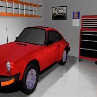
If you were reading and understanding so far, you can
see that the characters will be standing on top of the car.
As a creator, what do you think would be the
solution to using this backdrop in Comic Chat?
|
Would you simply flip the scene horizontally?
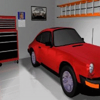
Ahh! Now we will have our characters standing on
the concrete inside the garage rather than on top of the car!
Very good!
|

Next, continuing with the Room4 example, do you detect anything odd about this picture? Doesn’t it look a little squished? Well that is because it is! Apparently this picture was not a perfect square when it was originally selected.

|

It was probably proportionally more like 260x200 that someone squished into a 200x200 square. This garage scene doesn’t look natural being squished! It should have been cropped into a square, rather than squished! So let’s fix this and see what’s left!
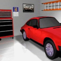
|

The Comic Chat program uses backdrops that are 315 x 315 pixels in size.
This backdrop, however, was originally sized to 200 x 200, so we kept it in that reference to maintain the integrity of the graphic. So first we resized it to 240 x 200 to eliminate the squished appearance .
We then cropped off the 40 pixels to make it square 200 x 200, (but not squished), for use in Comic Chat. That loss. (the head light), will actually hardly ever be seen since it is on the far right and will rarely be displayed in Comic Chat unless one fills the panel with 4 or 5 characters.
Always be mindful when creating or selecting a scene to be used in Comic Chat as a backdrop. Don’t just go willy-nilly and grab a bunch of your favorite pictures to show off in Comic Chat! You have to be considerate as to where your actors/characters will be in your scenes! There is a website that is full of badly created backdrop files that will never be linked to since they are just terrible as Comic Chat backdrops!
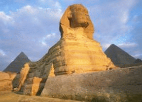
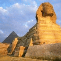
Let’s do another example of an existing backdrop. This one is called Spinx.
I will only show you the before and after graphics, since the text will be similar to what we already discussed.
|

 |

 |

 |
| Original (squished) pin head |
Elongated to normal |
Cropped for Comic Chat |
|

One can see the difference. The person who originally created this backdrop most likely did not yet understand how Comic Chat uses backdrops. So it was created using its entirety rather than considering how it would look in Comic Chat if used ‘as received’. Actually, when elongated to normal and then cropped, it made more room on the left hand side of the scene for the characters to stand.
Next: One more example to do with a scene providing a place for your characters to stand:
Here is another existing backdrop that I think is really cool, one of my favorites, called ‘Bluehills”.
It is actually a real picture of the Blue Ridge 'Smokey' Mountains: |


Awesome! But No place to stand!
Characters would be floating in the air!
...(like V-Chat) |

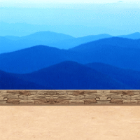
A wall and a decomposed granite surface added!
Looks like a pull-out along the highway!
Characters would be standing on the DC granite! |

Here, someone edited the first backdrop and added a place for the characters to stand!
You may have a graphic or drawing that you would like to use as a backdrop. we hope that these suggestions can help you select or edit your material to create a better backdrop for your characters in Comic Chat.
Before Rick wrote the AVBuster program, we would use the invis.avb character and select Comic Chat to display only one panel. Then, when first entering an off-line room, we would just hit enter (with no text) to get that first panel that shows the entire backdrop. We would then use Windows snipping tool to grab a snip of the backdrop to further edit as we saw fit for web graphics and such. Thanks now to AVBuster, those days of frolic are no longer necessary! The larger the first file, dimension wise, the better/easier it is to edit and clean up! Thus the single panel routine!
If you have created/selected some of your favorite graphics to use in Comic Chat, you can test them in Comic Chat as .BMP files. Once you are satisfied that they are perfect, then you can send the .BMP files to ‘Phoenix Comic Chat Nexus’ (zipped) for converting and posting for auto-download use as .BGB files! (Or we can edit them for you if needed).webmaster@phoenix-online-nexus.com
HOME
|
|
|

 |


